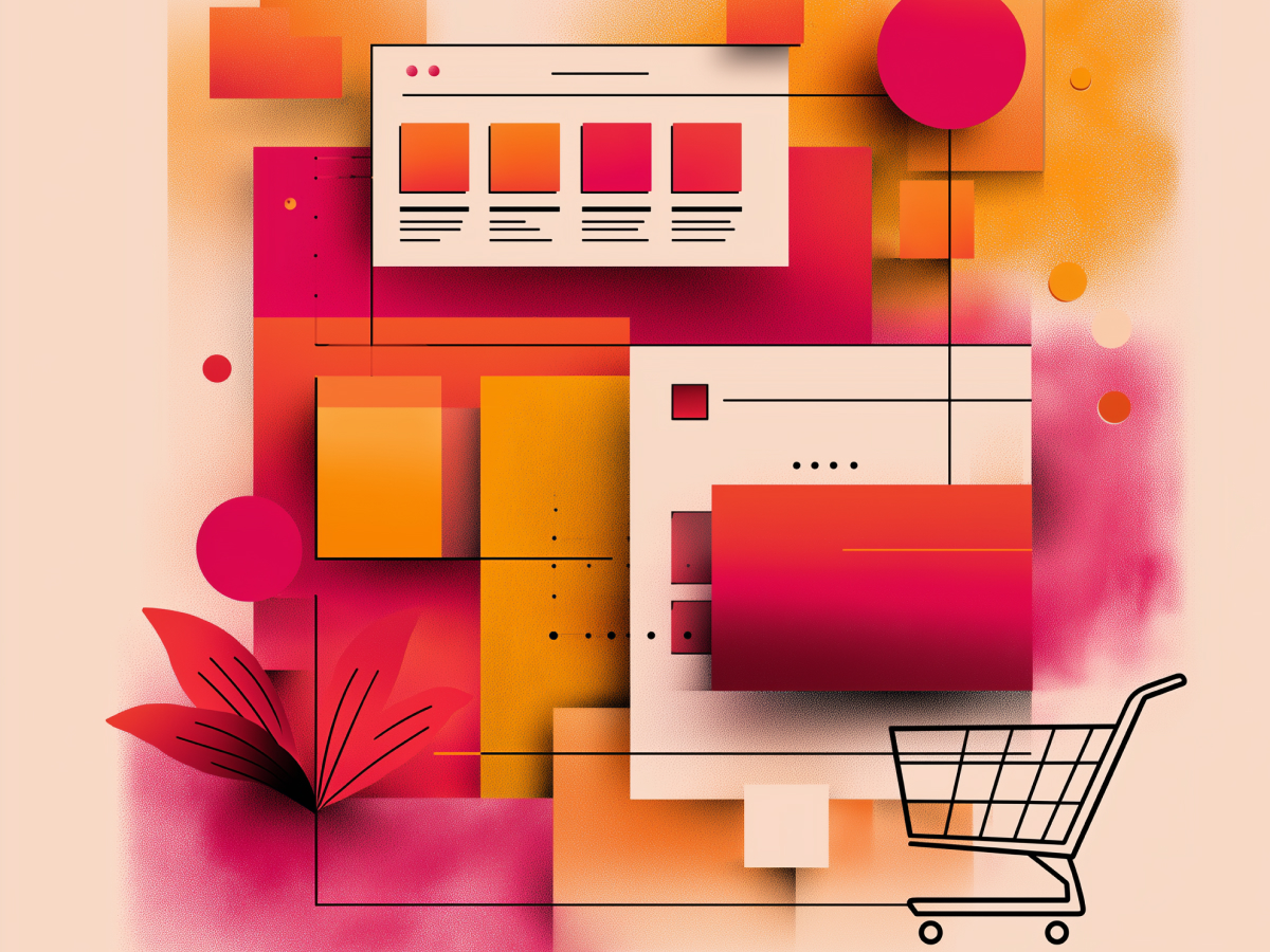
UX design has a direct, measurable impact on conversion rates
User experience is core infrastructure for digital growth. When it works, conversion rates explode. When it fails, your traffic evaporates. There’s a clear connection between how intuitive your product feels to a customer and how often that customer takes action, whether that’s buying, signing up, or sticking around.
This isn’t hypothetical. We’ve seen that a single second delay in page load time drops conversion by 7%. That one second matters. Clean UX? It can drive conversion rates up by 200%, and when paired with an intuitive interface, by as much as 400%. These aren’t small variations, they’re performance multipliers.
What’s often missed in boardrooms is this: Every dollar you put into UX has one of the best financial returns in business. A dollar invested in UX design delivers an average return of $100. That’s a 9,900% ROI. You don’t get that from most spending categories. This is not about luxury refinements, this is about making more money from the users you already have.
It scales. Strong UX keeps customers coming back, which matters because acquiring a customer is five to twenty-five times more expensive than keeping one. Add just 5% to your retention rate, and profits can jump by up to 25%. Users don’t necessarily need more features. They need fewer frustrations. Eliminate friction, and you unlock value that’s already there. Most companies don’t realize how much they’re losing until it’s too late.
If you’re looking to outperform, start with how people interact with your digital platforms. Every tap, scroll, or hesitation is real data. And that data is telling you where your revenue is leaking, or growing.
Simplified, intuitive navigation boosts user engagement and conversions
People don’t want to figure things out, they want to get where they’re going with minimum effort. Navigation is not decoration. It’s your operational pathway for how people move through your experience. If that path is too long or too confusing, they leave.
Data tells the story. Roughly 38% of users judge your site first by how it’s structured, specifically, by how easily they can navigate it. The “three-click rule”? It holds up conceptually. Users should be able to get to the information or product they want in three clicks or fewer. Whether it’s precisely three isn’t the point. Simplicity is.
If your menu takes them down a rabbit hole or forces them to learn your internal logic, they’ll walk away. That’s not a user problem, it’s a design failure.
Refining navigation means eliminating noise and focusing on meaningful, user-first page hierarchies. Use clear labeling. Prioritize key conversion pathways. When it comes to landing pages, often less is more. Users on product or pricing pages don’t need to explore, they need to act. Strip out what doesn’t push them forward. Keep them focused.
Add functional tools that move fast, search bars with autosuggest, filters that work dynamically. These aren’t bells and whistles. They double your conversion potential by letting high-intent users act immediately.
You’re shaping behavior. Each added click, each extra second, each moment of confusion adds friction. In digital, friction equals loss. Build pathways, not puzzles. Let people move the way they naturally would. If you get that part right, conversion takes care of itself.
Fast page load times are crucial for retaining visitors and maximizing conversions
Speed is the baseline. If your platform isn’t loading in under three seconds, you’re losing business, full stop. Nearly 40% of people abandon a site that takes longer than that. The faster your page loads, the more likely users are to stick around, engage, and convert. The expectation is immediate access, not patience.
The numbers are sharp. A one-second delay cuts conversion rates by 7%. Stretch that to eight seconds, and bounce rates increase by 24.4%, while conversion can drop by more than half. This isn’t the place to compromise.
Fixing it isn’t complicated, compress your images, strip out unnecessary scripts, and don’t load assets that people aren’t seeing. New image formats like WebP and AVIF reduce file sizes by over 50% without downgrading quality. That matters, especially on mobile. Use lazy loading for off-screen images and minify your JavaScript. Make sure scripts don’t block what the user sees first.
Use a CDN (Content Delivery Network) to deliver files from servers physically closest to your user. That lowers latency and makes content load faster worldwide. Implement strong browser caching, so returning users don’t need to repeatedly download the same assets. Configure your Time To Live (TTL) strategies properly, your servers and users both benefit long-term.
Mobile performance isn’t optional. Most users are mobile-first now, and Google indexes your mobile version, not desktop. If you’re not optimized on that end, your rankings will suffer, and your users will leave. Keep Core Web Vitals strong, especially Largest Contentful Paint, and trim anything you don’t absolutely need.
You don’t have time to lose people. Walmart found that every one-second improvement in load time translated to a 2% increase in conversions. Another platform, COOK, raised their conversions 7% just by shaving 0.85 seconds off load time. These gains are direct, meaningful, and easy to miss if you’re distracted by less impactful touchpoints.
Consistent, clean visual design enhances credibility and encourages action
First impressions happen fast, typically within 0.05 seconds of a page loading. If your visual presentation feels off, too cluttered, too inconsistent, too complicated, users distrust what they’re seeing before you’ve even delivered your message. Design consistency builds immediate confidence.
Consistency means sticking to defined color systems, typography, and spacing across the entire experience. One way to make this work effectively is the 60-30-10 color ratio: 60% for your dominant brand color, 30% for secondary accents, and 10% for highlights like buttons or links. This pushes visual hierarchy into the background, so users can focus on content without feeling overwhelmed.
Typography matters more than many realize. Users won’t stick around if they have to squint or decode low-contrast text. Choose readable, scalable fonts. Use larger font sizes, especially for mobile or audiences over 40, which make up a significant percentage of online consumers. Low visual strain increases interaction. That’s the goal.
A clean layout isn’t minimalism for aesthetics. It’s about clarity. White space isn’t wasted space, it guides the eye. Well-structured grid systems and careful spacing create a sense of order. People don’t need to think about the layout. They just use it. That assists with processing speed and reduces fatigue.
Avoid placing visually busy elements that compete for attention. Complexity increases cognitive load. If someone needs to pause and process what you’re showing them, you’re already too late. Reduce the number of on-screen elements to only what matters. Focus users on one clear direction.
Clean interfaces aren’t decoration. They’re a direct performance lever. 75% of a website’s credibility is based on design. Companies that maintain brand consistency across all digital touchpoints can see revenue increases of 10–20%. That’s not theory, it’s well-documented execution. Pull that off consistently, and trust follows automatically.
Clear, compelling CTAs drive user conversions
A call to action isn’t just a button, it’s the final decision point. If you get it wrong, users hesitate or leave. If done right, it drives results. Placement, copy, design, and timing all shape whether people act.
Start with clarity. Users need to know exactly what happens when they click. Be direct, use action verbs like “Get,” “Start,” “Join,” or “Download.” These are short prompts, but they remove ambiguity and create motion. Testing shows that switching to first-person phrasing—“Get my report” instead of “Get your report”, can increase clicks by 90%.
Strategic placement is just as important. More than half of users spend the most time above the fold, but that doesn’t mean your only CTA lives there. Smart layout uses multiple CTAs at key points, after you explain a product’s benefit, near pricing details, or when a user reaches the bottom of a scrollable page. Place secondary CTAs with lower visual emphasis so they’re visible without competing with the primary one.
Design matters. Colors must contrast with the background, making the CTA easily scannable without being aggressive. A muted background with a high-impact button pulls focus without confusing the eye. Test rounded edges vs. rectangular ones. Test size on mobile, Apple’s guidance recommends at least 44×44 pixels. Choose styles that perform with your audience, not what looks trendy.
Don’t forget behavior. Sticky CTAs, buttons that remain visible as the user scrolls, give a persistent action option without forcing them to stop. This is efficient and leads to higher performance, especially on long-form content or complex product pages.
The difference between a high-converting CTA and a weak one doesn’t come down to intuition. It comes from market-tested details. Personalized CTAs outperform generic ones by 202%, and well-placed CTAs on the right side of the screen have shown conversion lifts of up to 47%. These aren’t marginal wins, they’re performance shifts backed by user data. Optimize where it matters.
Trust-building UX elements reduce purchase friction and increase confidence
Trust decides whether someone completes a purchase. If your site doesn’t feel credible, users don’t need more convincing, they just leave. Trust isn’t abstract, it’s component-built through UX choices like testimonials, security badges, clear policies, and familiar user patterns.
Social proof is essential. People want assurance that others have used your product and had a good experience. Surface testimonials near decision points, especially checkouts or sign-up forms. Don’t stop at generic praise. Highlight results, specifics, and diversity of user types. Video testimonials further humanize the message and show real-user success.
Security indicators play a decisive role, particularly in e-commerce funnels. Display SSL badges, encryption icons, and certification logos from trusted providers like Norton, McAfee, or TRUSTe. Featured close to the checkout area, they tell users that their data is handled securely. These signals lift conversion by as much as 32%. Their absence causes 61% of shoppers to abandon a purchase.
Clear, transparent communication goes further. Use plain language in privacy policies, refund guarantees, and shipping terms. Don’t bury key information in dense legal text. When people don’t fully understand what happens after they buy, hesitation creeps in. Minimize surprises.
Every small cue that reduces uncertainty plays a role. You’re not trying to impress users, you’re trying to reassure them. The quieter trust signals are, implemented in design, layout, and copy, the stronger their effect. Research reflects that 98% of people consider trust signals important when shopping online. If you don’t control that narrative, you allow friction to define the user’s decision.
Trust isn’t earned by accident. It’s designed.
Optimization should follow a step-by-step strategy and evolve with user behavior
UX optimization works best when done methodically, not all at once. Start with the highest-impact areas, navigation, load speed, page clarity. These influence whether users stay long enough to see your value. After that, you layer in progressive improvements: refined visual design, targeted CTAs, and trust signals that reinforce user confidence.
The goal isn’t to reimagine your interface every few months. It’s to improve usability systematically, track the results, and iterate. Every interaction on your platform, clicks, scrolls, adds-to-cart, time on page, tells you what’s working and what isn’t. Use that behavioral data. Don’t rely on assumptions.
Start with flow. If people can’t find what they need, or if pages lag, they won’t care how sleek your design is. Fix structure and speed first. Then, improve visual hierarchy to guide people more effectively. After that, refine messaging and micro-interactions. Each step enhances the next.
Track what happens. Use KPIs tied directly to user outcomes, conversion rate, churn, bounce rate, time to purchase. Optimization isn’t subjective. It’s performance-based. And when done right, it compounds. Higher retention rates lower acquisition costs. Smoother flows drive lifetime value. You don’t have to guess.
The economics are established: customer acquisition costs 5 to 25 times more than retention. Improve retention by 5%, and you can see profit increase by up to 25%. So the fastest ROI isn’t always in new features or marketing bursts, it’s tightening the experience for the people already coming to you.
Decision-makers should establish UX as a long-term strategy. Treat the user experience as living architecture. Small changes create measurable returns. And the companies that optimize continuously often win, not because they move faster, but because they improve more consistently.
The bottom line
UX isn’t about making things look nice, it’s about making digital experiences convert. Every element you refine, from page load speed to button copy, directly impacts how your users behave. The results you want, higher conversion rates, better retention, stronger revenue, depend on how easy it is for people to move through your platform without friction.
This isn’t a one-time fix. Markets shift, behaviors change, technology evolves. What works today won’t stay relevant forever. The companies getting this right aren’t guessing, they’re listening to user data, optimizing continuously, and aligning design with measurable business outcomes.
If you’re pushing for growth, you don’t need more complexity. You need clarity, speed, and trust built into every digital touchpoint. That’s where conversion happens. And it’s where your next round of growth is sitting, waiting for better execution. Build for that.